Example 1
The table below shows the times taken by a group of walkers to complete a 15-mile walk. Their times have been recorded to the nearest hour.
Illustrate the data using a bar chart and a frequency polygon.
| Time (hours) | 3 | 4 | 5 | 6 | 7 | 8 |
|---|---|---|---|---|---|---|
| Frequency | 2 | 5 | 12 | 11 | 4 | 3 |

A time of 5 hours actually means a time that is greater than or equal to 4 hours but is less than 5 hours, so the bar representing this time on the bar chart will begin at 4.5 and end at 5.5.
Similarly, the bar for a time of 3 will begin at 2.5 and end at 3.5.
The bar chart is shown below:

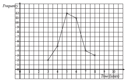
The frequency polygon is shown below. We obtain it by joining the midpoints of the tops of the bars from the previous graph.
Example 2
At a school fair, visitors enter a 'Guess the weight of the cake' competition. Their guesses, rounded to the nearest 100 grams, were recorded in the following table:
| Guess (kg) | 0.5 - 0.7 | 0.8 - 1.0 | 1.1 - 1.3 | 1.4 - 1.6 | 1.7 - 1.9 |
|---|---|---|---|---|---|
| Frequency | 5 | 32 | 26 | 11 | 6 |
Illustrate the data using a bar chart.
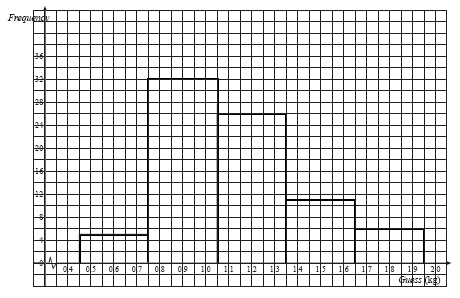
The guesses have been recorded to one decimal place, in other words to the nearest 100 grams. This means that the first category, nominally described as '0.5 - 0.7 kg' actually includes guesses greater than or equal to 0.45 kg but less than 0.75 kg. The precise description of the first category is therefore
0.45 kg ≤ guess < 0.75 kg
The nominal descriptions of the other classes must also be interpreted precisely if we are to represent the data accurately.
| Guess (kg) | 0.45 ≤ G < 0.75 | 0.75 ≤ G < 1.05 | 1.05 ≤ G < 1.35 | 1.35 ≤ G < 1.65 | 1.65 ≤ G < 1.95 |
|---|---|---|---|---|---|
| Frequency | 5 | 32 | 26 | 11 | 6 |
The precise descriptions of the classes indicate how the bars should be drawn on the bar chart.
Estimate the mean of the data.
The mean can be estimated by assuming that all the values in a class are equal to the midpoint of the class.
| Class | Midpoint | Frequency | Frequency × Midpoint |
|---|---|---|---|
| 0.45 ≤ G < 0.75 | 0.6 | 5 | 5 × 0.6 = 3 |
| 0.75 ≤ G < 1.05 | 0.9 | 32 | 32 × 0.9 = 28.8 |
| 1.05 ≤ G < 1.35 | 1.2 | 26 | 26 × 1.2 = 31.2 |
| 1.35 ≤ G < 1.65 | 1.5 | 11 | 11 × 1.5 = 16.5 |
| 1.65 ≤ G < 1.95 | 1.8 | 6 | 6 × 1.8 = 10.8 |
| TOTALS | 80 | 90.3 | |
State the modal class.
The modal class is the one with the highest frequency. In this case, the modal class has nominal description '0.8 - 1.0 kg', which means guesses in the interval