Unit 8 Section 3 : Plotting Scatter Diagrams
In this section we review plotting scatter diagrams and discuss the different types of correlation that you can expect to see on these diagrams.

Strong positive correlation between x and y. The points lie close to a straight line with
y increasing as x increases.
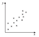
Weak, positive correlation between x and y. The trend shown is that
y increases as x increases
but the points are not close to a straight line.
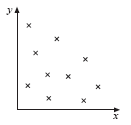
No correlation between x and y; the points are distributed randomly on the graph.

Weak, negative correlation between x and y. The trend shown is that
y decreases as x increases
but the points do not lie close to a straight line.
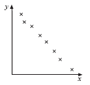
Strong, negative correlation. The points lie close to a straight line, with
y decreasing as x increases.
If the points plotted were all on a straight line we would have perfect correlation, but it could be positive or negative as shown in the diagrams above.