Example 1
Draw a line of best fit for the points in the following scatter graph:

(a)
Use the data to draw a scatter graph.

Note that there are 3 points above the line and 3 below. The total distances to the points above the line is similar to the total distance to the points below the line.
(b)
Use the line to predict the value of y when x = 12.
Using the dotted line, we have y = 6.4 when x = 12.
Example 2
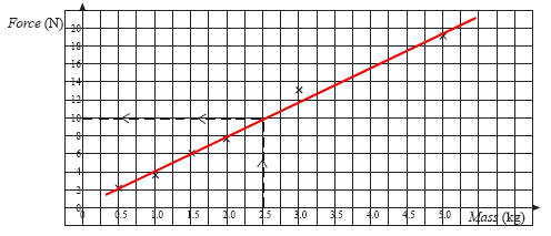
The following data was collected from an experiment. In the experiment, objects of different masses were placed on a horizontal surface and the force needed to make them start to move was recorded.
| Mass(kg) | 0.5 | 1.0 | 1.5 | 2.0 | 3.0 | 5.0 |
|---|---|---|---|---|---|---|
| Force(N) | 2.1 | 3.8 | 6.1 | 7.9 | 13.2 | 19.1 |
Use a scatter graph to estimate the force needed for a 2.5 kg mass.