
Correlation and Regression
Correlation

You have probably already met the concept of correlation between two sets of data and will have used scatter diagrams for plotting a series of data points (x_i, y_i), and then defined:

These are examples of bivariate data, where two variables are related.

The next two Worked Examples illustrate what you need to know.

Worked Examples
1

(a)

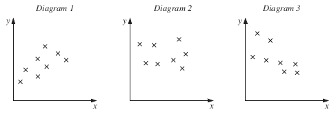
Write down the number of the diagram that is most likely to represent

(i)

the heights of a group of boys on the x axis and the sizes of shirts worn by them on the y axis,

Show me Diagram 1 (size increase with height)
(ii)

the mean temperature during the day on the x axis and the amount of gas used to heat a house on that day on the y axis,

Show me Diagram 3 (the colder the day, the more gas is used)
(iii)

the shoe sizes of a group of adults on the x axis and their ages on the y axis.

Show me Diagram 2 (no particular relationship between shoe size and age)
(b)

Which diagram shows two variables which have

(i)

positive correlation,

Show me Diagram 1
(ii)

negative correlation,

Show me Diagram 3
(iii)

no correlation?

Show me Diagram 2
2

The scatter diagram shows the ages, in years, and the selling prices, in thousands of pounds, of second-hand cars of the same model. The cars have been advertised for sale in a local paper.
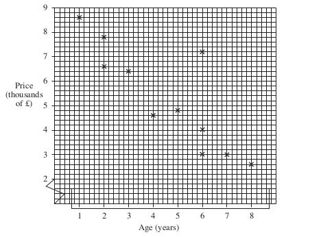
The price of one of these cars has been advertised wrongly.

(a)

Give the age and price of the car that you think is incorrectly advertise

Show me 6 years and £7200
(b)

How many cars are being advertised for sale?

Show me 11
(c)

Another car is to be included in the advertisement next week.

The car is four years old.

Do you think the price will be more than £6500 or less?

Give a reason for your answer.

Show me Less than £6500 if it follows the above trend.
(d)

What type of correlation does the diagram show?

Show me Negative correlation

Exercises

A guide to used cars shows the engine size in cc and the mileage per gallon.

(a)
CarABCDEFGH
Engine size (cc)100011001300140019001800
Mileage per gallon403638343220
(b)

One car does not appear to follow the trend. Which one is it?

Mary was ill. Her temperature was taken and recorded every hour between 12 noon and 6 pm.

Time12
noon
1 pm2 pm3 pm4 pm5 pm6 pm
Temp (°C)37.039.540.039.038.237.737.2
(a)

Draw a suitable diagram to represent these data in your exercise book and use it to estimate:

(i)

the time at which Mary's temperature first rose above 38.5 °C.

At about pm
(ii)

Mary's temperature at 3.30 pm.

°C
(b)

A normal temperature is 37 °C.

Her temperature continues to fall at the same rate until it reaches 37°C.

Use your diagram to estimate the time at which Mary's temperature returns to 37°C.

At about pm

The following data relate to the age and weight of ten randomly chosen children in Bedway Primary School.

Age (years)7.88.16.45.27.09.98.46.07.210.0
Weight (kg)29282620243530222536

Draw a scatter diagram in your exercise book to show this information.

The mean age of this group of children is 7.6 years.

(a)

Calculate the mean weight of this group.

kg
(b)

Use your graph to find the equation of this line of best fit, in the form

y = mx + c.

y =
Jane is a pupil at Bedway Primary School and her age is 8.0 years.
(c)

Use your answer to (b) to estimate Jane's weight.

kg
(d)

Would a prediction of the weight of a twelve year old from your graph be reliable?

20 students take a Spanish written test

The scatter diagram shows their marks and the number of Spanish lessons they had missed during the year.

(a)

Write down the mark of the student who missed most lessons.

(b)

Write down the number of lessons missed by the student having a mark of 36.

(c)

One student missed many lessons but still had a high mark in the test.

Write down the mark and number of lessons missed by this student.

mark:

number of lessons missed:

(d)

The teacher looks at the scatter diagram and concludes:

"The more Spanish lessons a student attends, the higher their mark in the written test."

Does the information in the scatter diagram support this conclusion?