
Bar charts and pictograms can be used for displaying data when the data are in discrete categories.
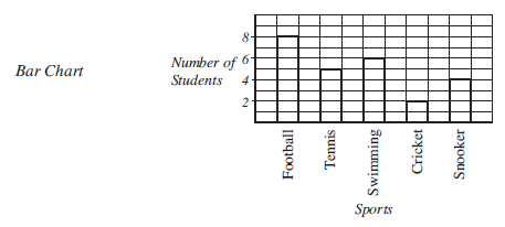
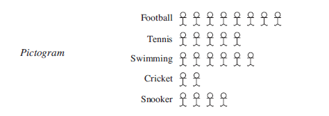
For example, the bar chart and pictogram below show the favourite sports of 25 students.
Worked Examples
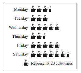
The pictogram shows the number of customers using a coffee shop during one week.
How many customers used the shop on Wednesday?
Show meFor Wednesday there are 5 symbols, so the number of customers was
5 × 20 = 100
How many customers used the shop on Monday?
Show meFor Monday there are symbols, so the number of customers was
× 20 = 70
How many customers visited the coffee shop during the week?
Show meThe total for the week is given by
70 + 60 + 100 + 50 + 100 + 130 = 510 customers.
John asked each person in the class what their shoe size was. He obtained these results.
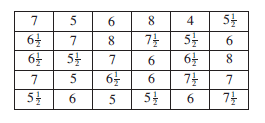
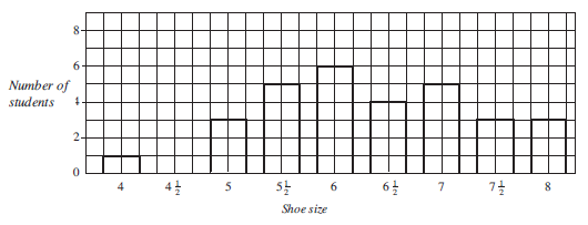
Draw a bar chart to show this data.
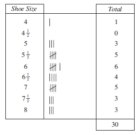
First the data can be entered into a tally chart, as shown here.
The bar chart can be drawn as shown below.
The table below shows the number of chocolates sold by the school canteen for a given week.

How many more chocolates were sold on Friday than on Tuesday?
Show me60 − 45 = 15. So 15 more chocolates were sold on Friday than on Tuesday.
What was the total number of chocolates sold for the week?
Show meTotal = 22 + 45 + 58 + 35 + 60 = 220 chocolates.
What was the mean number of chocolates sold daily?
Show me(Mean is covered in detail in another unit.)
| Mean | = |
| = = 44 |
Draw a bar chart to show this data.
Show me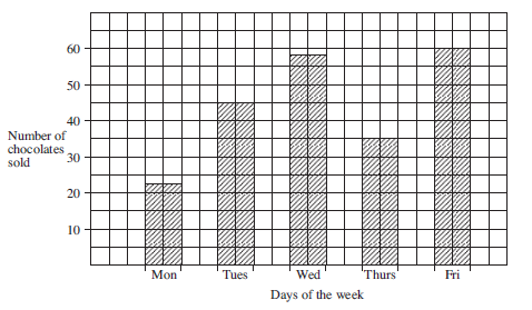
What is the probability that on a day chosen at random, less than 50 chocolates were sold?
Show me(Probability is covered in detail in another units.)
p(no. chocolates < 50) = (= 0.6)
(The mean of a group of numbers is the average of those numbers.)
Exercises
